Rainbow Wheelchair Symbol: What It Really Stands For
Author: Ian C. Langtree - Writer/Editor for Disabled World (DW)
Published: 19 Jun 2026 - Updated: 20 Jun 2026
Publication Type: Informative
Table of Contents:
Synopsis - Definition - Introduction - Main - Insights, Updates - Related Content
Synopsis: The blue wheelchair sign is one of the most recognized images on the planet, but its rainbow-colored cousin sparks a flurry of questions every time it appears on a flag, a sticker, or a painted playground wall. This paper cuts through the confusion to explain exactly what the rainbow wheelchair symbol stands for, tracing it back to the official International Symbol of Access and forward into the vibrant world of disability pride, where color has become a quiet act of resistance and a loud celebration of belonging.
At a Glance
- 1 - There is no single official rainbow wheelchair symbol - the legally recognized sign for accessible spaces is still the blue and white International Symbol of Access.
- 2 - The widely used Disability Pride Flag was redesigned in 2021 with muted colors after the original bright zigzag version was found to trigger discomfort for people with visual sensitivities.
- 3 - A rainbow wheelchair symbol often signals the intersection of disability and LGBTQ+ identity, letting people express both parts of who they are at the same time.
- Topic Definition: Rainbow Colored Wheelchair Symbol
The rainbow-colored wheelchair symbol is a multicolored variation of the standard accessibility icon - the seated wheelchair figure - rendered in the bands of a rainbow rather than the official blue and white. Unlike the International Symbol of Access, it has no formal legal status and does not change anyone's parking or accessibility rights. Instead, it works as an expressive emblem, used to celebrate the wide diversity of the disability community, to signal solidarity with people who are both disabled and LGBTQ+, and to communicate a broad spirit of inclusion and welcome.
Introduction
The Rainbow Wheelchair Symbol and Icon
Most people can picture the standard accessibility symbol without much effort: a simple white figure seated in a wheelchair, set against a deep blue square. It appears on parking spaces, restroom doors, elevators, and building entrances all over the world. But every so often a different version turns up - the same seated figure, only rendered in the bright bands of a rainbow. People notice it on social media, painted across school playgrounds, decorating a friend's wheelchair, or flying as part of a flag during Disability Pride Month. The natural question follows quickly: what does the rainbow-colored wheelchair symbol actually mean, and does it carry any official weight? This paper answers that question plainly, separating what is genuine and meaningful from what is myth.
Main Content
The Starting Point: The Standard Wheelchair Symbol
To understand the rainbow version, it helps to start with the original. The familiar blue-and-white image is formally called the International Symbol of Access, often shortened to the ISA. It was designed in 1968 by Danish design student Susanne Koefoed and was later adopted and refined by Rehabilitation International, the organization that helped spread it globally (Guffey, 2018). The symbol was never meant to represent only people who use wheelchairs. Instead, it signals that a place, service, or facility has been made accessible - that ramps, wider doorways, reserved parking, or other accommodations are present.
This distinction matters because it explains why so many different groups feel a sense of ownership over the symbol. The wheelchair figure has become a kind of shorthand for the entire idea of accessibility and, more broadly, for disability itself, even though the disability community is enormously varied and most disabilities are not visible at all. Once you understand that the ISA is essentially a public promise of access, the colorful variations begin to make a lot more sense.

So What Exactly Is the Rainbow Wheelchair Symbol?
Here is the most important fact to establish up front: there is no single, official, internationally recognized "rainbow wheelchair symbol." The blue ISA remains the only version that carries legal and regulatory meaning under standards such as the Americans with Disabilities Act in the United States and similar accessibility codes elsewhere. When you see the wheelchair figure colored in rainbow stripes, you are almost always looking at an expressive or symbolic variation rather than a legally defined sign.
That does not make it meaningless - far from it. The rainbow version is used deliberately and thoughtfully in several distinct ways, and the intended message depends heavily on context. Broadly speaking, a rainbow-colored wheelchair symbol communicates one or more of the following ideas: celebration of the diversity within the disability community, solidarity at the intersection of disability and LGBTQ+ identity, and a general spirit of inclusion and welcome. The sections below unpack each of these meanings.
Meaning One: Celebrating Diversity Within Disability
The disability community is not a single, uniform group. It includes people with physical disabilities, sensory disabilities such as blindness or deafness, cognitive and intellectual disabilities, mental health conditions, and a vast range of invisible or undiagnosed conditions. A rainbow applied to the wheelchair figure is often a visual way of saying that disability comes in many forms and that all of them belong.
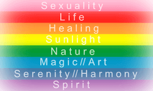
This idea connects closely to the broader symbols of the disability rights movement. The most prominent of these is the Disability Pride Flag, created by the disabled activist Ann Magill. Her original 2016 design featured a bright rainbow lightning bolt against a black field. After community members pointed out that the zigzag pattern and vivid clashing colors could trigger discomfort or even seizures for some people with visual sensitivities, Magill revised the flag in 2021 (Magill, 2021). The updated version uses a charcoal-gray background crossed by five muted parallel stripes, and each color carries a specific meaning:
- Red represents physical disabilities.
- Gold represents neurodivergence and cognitive or intellectual disabilities.
- White represents invisible and undiagnosed disabilities.
- Blue represents psychiatric and emotional disabilities.
- Green represents sensory disabilities.
The diagonal arrangement of the stripes was chosen to represent "cutting across" the barriers - the walls and ceilings - that have historically kept disabled people excluded from full participation in society. The charcoal background, meanwhile, was chosen to acknowledge grief and anger over the lives lost to ableism and neglect. When a rainbow wheelchair symbol appears alongside or in the spirit of this flag, it usually carries the same layered message of pride, mourning, resilience, and belonging.
A Note on the Word "Rainbow"
It is worth clarifying that the disability pride flag is not, strictly speaking, a rainbow in the LGBTQ+ sense - its colors are deliberately muted and its meaning is specific to disability. People sometimes describe it casually as "the rainbow disability flag," which can cause confusion. The takeaway is that multiple colors do not automatically mean the same thing in every context, so reading the surrounding cues is essential.
Meaning Two: The Intersection of Disability and LGBTQ+ Identity
A second and very common use of the rainbow wheelchair symbol draws directly on the LGBTQ+ rainbow flag, popularized by the San Francisco artist Gilbert Baker in 1978. Many people are disabled and also lesbian, gay, bisexual, transgender, or queer, and these identities do not exist in separate boxes. A person who places a rainbow pride sticker on their wheelchair, or who designs a wheelchair icon in pride colors, is often expressing both identities at once.
Writers in the disability community have described how powerful this small act of visibility can be. In one widely shared essay, a wheelchair user recounted how a young child noticed the rainbow pride symbol on her chair and responded with simple, open curiosity rather than discomfort - a moment that captured how visible symbols can normalize difference and open conversation (The Mighty, 2018). In this sense, the rainbow wheelchair symbol functions less like a regulatory sign and more like a personal flag: a way of saying "I am here, in full, and I am not hiding any part of myself."
Meaning Three: A General Signal of Inclusion and Welcome
Schools, businesses, community centers, and event organizers sometimes use a rainbow-colored wheelchair symbol simply to communicate warmth and openness. A bright, multicolored accessibility icon painted on a playground or printed on a welcome poster can feel friendlier and more affirming than the standard blue square. In these cases the rainbow is decorative and aspirational - a way of signaling that everyone is welcome and that accessibility is celebrated rather than treated as a grudging legal requirement.
This is also where a word of caution belongs. Because a colorful icon looks cheerful and official at the same time, it is easy to assume it has formal authority that it does not actually possess. That assumption is the root of a common misunderstanding, addressed next.
Clearing Up the Misconceptions
From time to time, claims circulate online suggesting that a rainbow or differently colored wheelchair symbol grants special legal privileges, identifies a particular category of permit holder, or replaces the official accessibility sign. These claims should be treated with healthy skepticism. As a rule, a rainbow wheelchair symbol does not change anyone's legal parking rights, does not create a new class of accessible space, and does not override local accessibility codes.
Legitimate accessible parking and facilities continue to be governed by the official blue ISA - or, in some jurisdictions, by the redesigned "Accessible Icon," a more dynamic figure shown leaning forward in motion that began as a Boston street-art project and has since been adopted by various cities and organizations (Hendren and Glenney, 2013). A rainbow version sitting on a wall or a flag is an expression of values, not a substitute for the regulated signage that defines legal access. If you ever need to confirm whether a parking space or facility is officially accessible, the controlling authority is your local building code and the standard symbol, not the color palette.
Why Symbols Like This Matter
It can be tempting to dismiss a recolored icon as a small thing. Yet symbols do real work. They tell people whether they are expected, whether a space was designed with them in mind, and whether their full identity is acknowledged. The history of the accessibility symbol itself shows how much design choices can shape attitudes - debates over the redesigned, forward-leaning Accessible Icon were ultimately debates about whether disabled people are seen as passive or active participants in their own lives (Hendren and Glenney, 2013).
The rainbow wheelchair symbol extends that same conversation. By adding color, the disability community and its allies push back against the idea that accessibility is a dull, bureaucratic afterthought. They reframe it as something to take pride in, something that includes a spectrum of bodies, minds, and identities. Whether it appears on a flag, a sticker, or a mural, the message is consistent: access is a matter of dignity, and everyone deserves to belong.
Conclusion
The rainbow-colored wheelchair symbol is best understood not as an official sign but as a meaningful expression. It builds on the universally recognized International Symbol of Access and recolors it to celebrate the diversity of the disability community, to honor the overlap between disability and LGBTQ+ identity, and to broadcast a welcoming spirit of inclusion. It carries no special legal authority - the regulated blue symbol still governs accessible parking and facilities - but its cultural weight is real. In a world that has too often treated disability as something to be hidden or merely accommodated, a wheelchair figure painted in rainbow colors makes a quietly radical claim: that access, pride, and belonging are things worth celebrating in full color.
References:
Guffey, E. (2018). Designing disability: Symbols, space, and society. Bloomsbury Academic.
Hendren, S., and Glenney, B. (2013). The Accessible Icon Project. Triangle.
Magill, A. (2021). The disability pride flag: Origins and meaning. Disability community publications.
Frost, N. (2018). The Controversial Process of Redesigning the Wheelchair Symbol (Atlas Obscura)
The Mighty. (2018). When a little girl noticed the rainbow pride symbol on my wheelchair. The Mighty.
Wikipedia contributors. (2024). International Symbol of Access. Wikipedia.
Insights, Analysis, and Developments
Editorial Note: In the end, the rainbow wheelchair symbol is proof that a small design choice can carry an enormous amount of meaning, transforming a plain regulatory icon into a banner for pride, diversity, and welcome - and reminding us that accessibility is not just a box to tick but a value worth showing off in every color of the spectrum. Author Credentials: Ian is the founder and Editor-in-Chief of Disabled World, a leading resource for news and information on disability issues. With a global perspective shaped by years of travel and lived experience, Ian is a committed proponent of the Social Model of Disability-a transformative framework developed by disabled activists in the 1970s that emphasizes dismantling societal barriers rather than focusing solely on individual impairments. His work reflects a deep commitment to disability rights, accessibility, and social inclusion. To learn more about Ian's background, expertise, and accomplishments, visit his full biography.